Note: This project was done as part of Springboard’s UX Design Certificate Course, a 3-month short course that takes you through the UX Process. Completed February 2019.
Review from Springboard Mentor: “Working with Mel on this project was great. The output of her work clearly shows how much careful thought and consideration she put into it. During each weekly session she was prepared with questions and assignments ready for feedback. It’s always a rewarding experience working with someone like Mel who works hard and puts in extra effort.” – Alex Clayton
The Challenge
I am a real estate marketing professional, and I work in an industry that is mostly made up of independent contractors. In that environment, you can see a wide range of service levels ranging from sloppy to excellent. One of the things I started noticing after working with many different levels of agents is how most real estate agents don’t loop their home buying and selling clients in on all aspects of the process, and most definitely don’t do it in a way that’s technologically savvy. Moreover, at the end of the transaction, many clients are left wondering where their final paperwork is! Agents can get by on communication solely through text or email, and while that may be sufficient for most people, there are a lot of disruptions happening in the industry coming from the tech sector. Starting soon, agents really have to start going above and beyond to deliver an experience that delights and informs their clients.
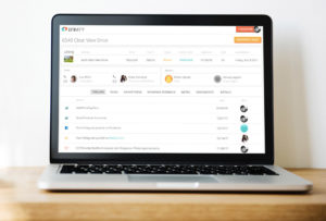
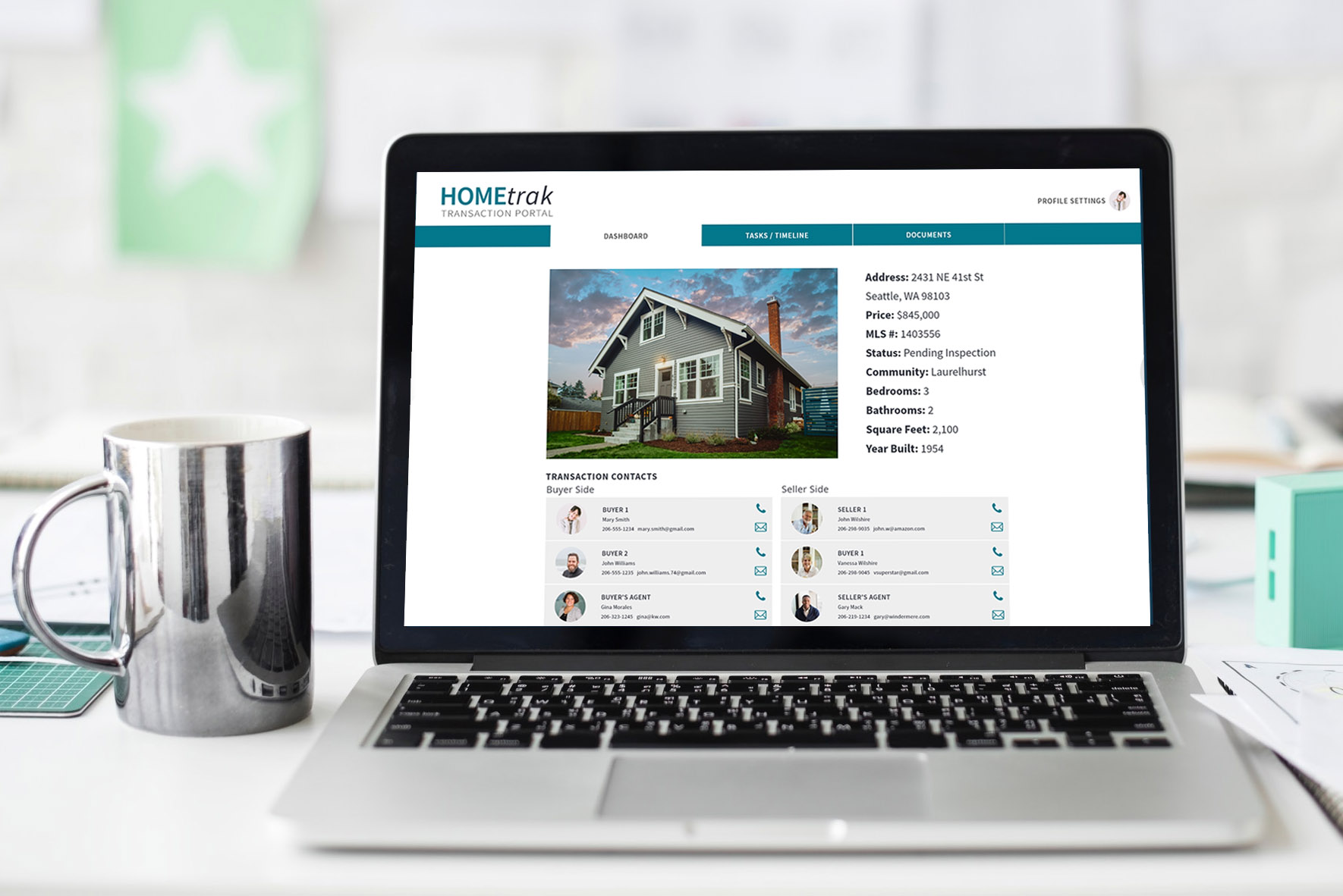
My project revolved around creating a client-facing real estate portal that would be an informational and interactive website where clients could come to check on the status of their transaction, make sure they’re on track, and view and download documents. It also helps clients to understand exactly what certain contract terms mean and is simple enough for even the most casual internet user to navigate and understand.
The Process
This project went through the whole UX Process, from screening and interviewing candidates to wireframing, user research, crafting a visual design and iterating on multiple prototypes.
Tools Used: Pencil and Paper, Google Forms, Autodesk Sketchbook, Adobe XD, Invision App, Proto.io, Draw.io, Marvel App.
Screening and Interviewing
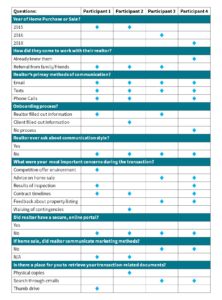
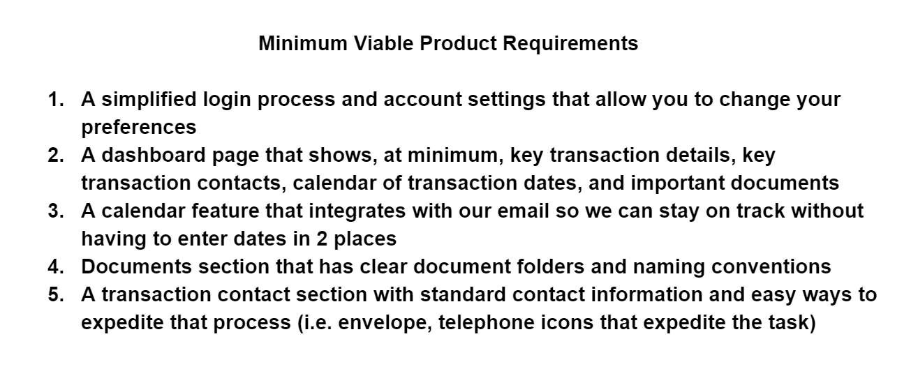
The screening process was fairly simple, as I targeted people who I knew had purchased homes in the last several years. (I wanted it to be in the last several years to keep it in the realm of modern technology offerings.) When I interviewed participants, I asked them specific questions about their experience working with a realtor in the home buying or selling process, how their realtor communicated, and what their most pressing concerns were during that process. I asked them questions like these in order to help craft the best features for a minimum viable product.
Heuristic Usability Analysis
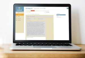
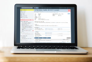
I compared three other transaction coordination programs on three usability principles that I uncovered as the most important after my user research; aesthetic and minimalist design, match between system and real world, and visibility of system status. There are a lot of transaction coordination programs out there for real estate, but the bulk majority of them are back-end only (i.e. only the agent and his/her team sees the information and files, and the client doesn’t have access.) I found two programs that were client-facing, one that was not, and I compared two parts of the programs; the onboarding process, and the dashboard interface. I discovered ideas for key features to integrate into my website, and also things not to do.
User Personas
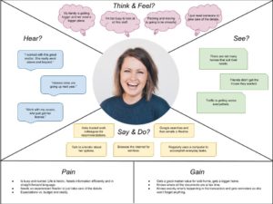
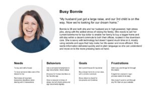
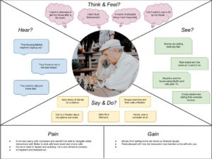
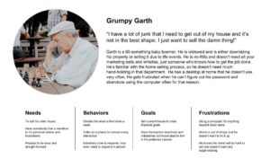
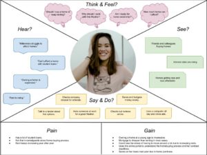
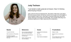
From my user interviews and my past experience working with clients in the real estate realm, I created three user personas which represent the different clients agents might serve (in our geographical area) and their various levels of technological ability. In creating these personas, I wanted to explore how the website I’m creating should be adaptable in different situations depending on the clients communication style and whether or not they would even visit or interact with such a portal.
Minimum Viable Product Guidelines
Information Architecture
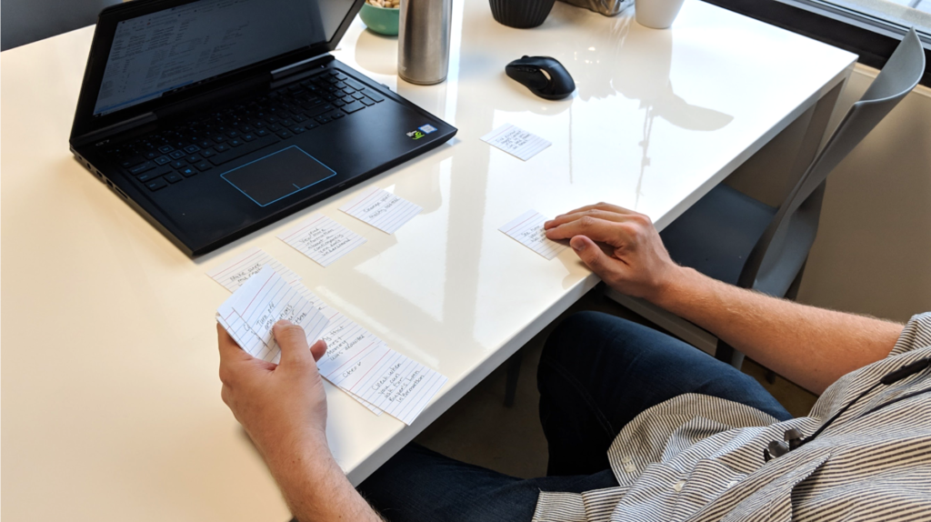
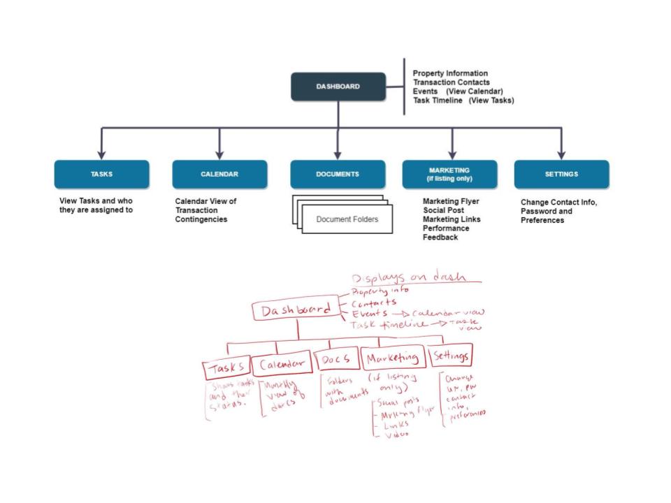
Even though the navigation of my website was going to be fairly simple, I still needed to discover if typical users felt the same way as I did about the specific site sections. I conducted a card sort activity with several people to complete hypothetical tasks to help categorize the site infrastructure. Most people were thinking along similar lines as I was, but I adjusted several things from my original thinking in the final site structure.
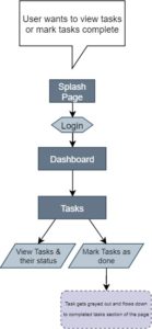
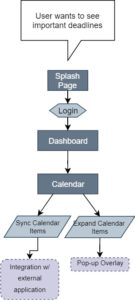
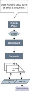
User Flows
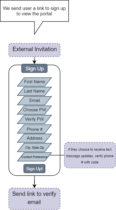
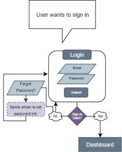
The user flows on the website aren’t very deep, as it’s a pretty simple and straightforward informational portal and doesn’t involve any tasks that require a series of screens such as searching or purchasing a product.
Wireframing
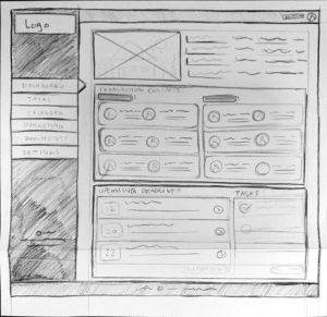
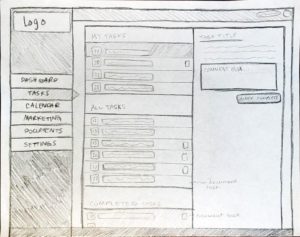
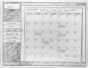
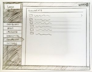
1st Round: Pencil Sketching
I decided to create a desktop website instead of an mobile app because the nature of the information is not something you need “on-the-go” – it’s not that dire. It’s something you would check while you’re at your work or home computer.
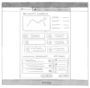
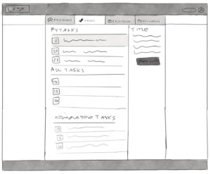
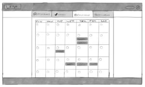
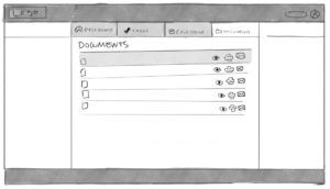
After feedback from my mentor suggesting the vertical navigation might not be the best choice, I quickly reiterated on some horizontal navigation sketches.
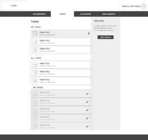
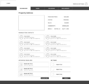
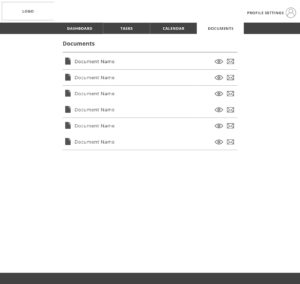
Upon further approval of the sketches, I created digital files and made a low-fidelity interactive prototype using Marvel App.
Visual Style
Usability Testing
After creating the low-fidelity prototype, I recruited some people who matched some of the target user personas, focusing on the “Grumpy Garth” persona and in-between. I wanted to focus on people who are less technology-savvy in order to make sure the website was usable for that demographic, but I also made sure to test all the demographic types. As I completed the user testing, I was able to discover the pain points for those people and discussed some alternatives for the layout. What I reiterated on for my final prototype was:
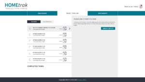
- Combining the Tasks/Calendar section into one section overall, that has a task and calendar view. The reason for this change was because tasks also have a due date, so why shouldn’t they be interchangeable? I gave people the option of selecting either a task list view or a calendar view where they would have the option to sync the calendar to an outside source as well.
- Removing other people’s tasks in order to make it less confusing (i.e. original prototype showed “All Tasks” including tasks belonging to other people involved in the transaction.) (See above images)
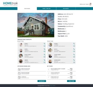
- Redesigning the layout for contacts making it more apparent where to click to email or call (call would be more applicable for mobile) the transaction contact.
- Made the layout about 25% smaller, as the elements of the low-fidelity prototype screens seemed comically over-sized.
Conclusion
Overall I found learning about the UX Design Process to be a fun and diverse experience with a landscape of interesting and challenging tasks. I created a desktop application, but while I was making prototypes, I realized that the interactions and animations for mobile apps are much more fun and customizable, so I wished I had decided to do a mobile app project. I may explore that in the future. I also enjoyed the User Flows part of the project, and wanted to have deeper user flows to explore, which was not required with the website I created.

